This is my group’s final Advertising Agency project. We created an advertising plan for an upcoming brand-new software for BYU-I. We assembled a book that had all of our mock up ads and explanations for everything. Oh, and the client picked our ad plan. No big deal… 😉
Here is a project I did for my COMM 230 Advertising class. We had to take an existing ad and change the content. What better subject than Disney World?
I was really excited for this project because I have always wanted to create a really cool photo book to showcase my images. I was particularly excited to design my photo book because design is something that I love to do. During this class we have concentrated more on photography than actual design, as opposed to Comm130. I was eager to be able to design something that I would be able to show off my photography work from this class
I think one of the hardest aspects of designing my photo book was to incorporate my style or voice into the design. When I created my watermark I picked a font that was modern but also fun. I decided to carry this font as a theme through my whole book. Although some have said that this font doesn’t look “professional”, I think it really portrays something different that isn’t the typical or expected style of a photographer. I really tried to make my book look different and unique while still being visually pleasing to look at.
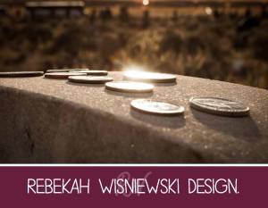
This picture was taken at Bannack Cemetery in Bannack, Montana. After our class trip to Bannack’s ghost town, we stopped at the cemetery to have a five minute photo contest. The challenge I was faced with was to find a unique shot I could find in just five minutes. This shot had to stand out among many others. What I really love about this shot is that I almost did not capture it, because I was very tired from the trip and decided last minute to stumble off the bus to take a few more pictures. The question I receive the most from this shot is whether I placed the coins or not, the answer is no. There were about three tombstones lined with these coins and I loved the way the setting sun reflected in the shiny coins. I decided to get down low so that the dramatic angle almost made it hard to tell exactly what was reflecting the light.
Although this picture came out of the camera well, I still needed to make a few edits. The biggest edit I made was I increased the contrast. I will always prefer a high-contrast image to a low-contrast image, so it isn’t surprising that I made this edit. Another edit I made was I increased the vibrance of the colors, especially the yellows and oranges. I wanted the setting sun to be a large part of the image. I also played with sharpening and clarity with the coins and the tombstone. Finally, I put a small black vignette around the edges of the image to make the colors pop just a little bit more.
Here are my top 5 shots from our light painting during class on Wednesday.
Done with a green flashlight
For this one I flashed the light from the lower right and left corners. I actually really like the way you can see a line of light coming from the right corner.
This one was fun and simple. I came across the gourds on the front and then came across the back of the gourds with the light.
I didn’t actually plan to spell “word?” out. I started setting up the first three letters and then went on the hunt for a “D”.
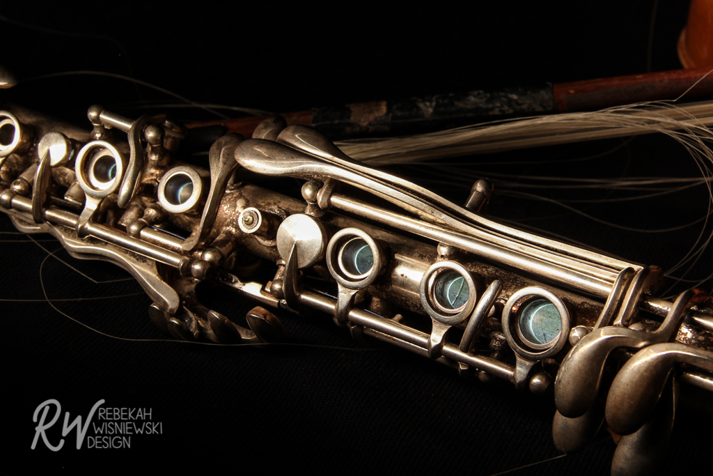
This one was really fun. As I was shining the light across the flute, I thought it might look really cool to shine the light inside the flute. I think it looks pretty cool if you notice that the finger holes are lit up, but it kinda goes unnoticed. I guess it is now a hidden gem.
Extra:
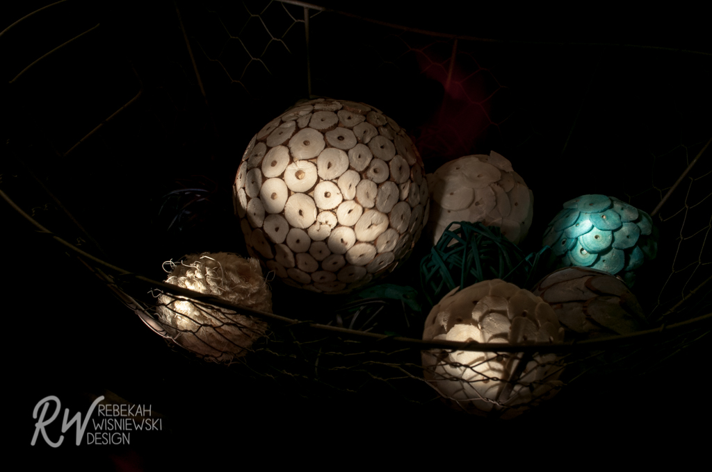
For this one I only lit up a couple of the balls. I think it looks kinda cool. 🙂
Obviously it was the equinox when I decided to try to balance some eggs. I decided to see if I could get any cool light painting shots with such a boring subject. I think it worked!